Montreal based UX designer - Case Study

The Problem
40,825 kg
= 🐘🐘🐘🐘🐘🐘🐘🐘🐘🐘
That's how much trash the average person leaves behind as their legacy

The Solution
Zero Waste
This app is a robust and consistent companion for the individual who is going on the journey of becoming zero waste or the person who wants to learn to make better waste decisions.
The 3 R’s method that I read about it in Charles Duhigg’s best–selling book, The Power of Habit, will be the basis of this habit-forming app:
Remind
Routine
Reward

These are all mandatory to be successful in changing one's habit.

My Role
User research & validation, persona creation, interaction design, user flows, wireframing, branding, visual design, prototyping, user testing & validation.
Timeline: 5 weeks
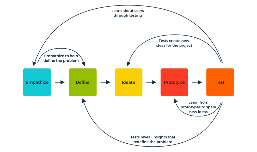
Author/Copyright holder: Teo Yu Siang and Interaction Design Foundation. Copyright terms and licence: CC BY-NC-SA 3.0
Competitive Analysis
To get a better understanding of what is already out there and how I can contribute to the space, I set out to do a competitive analysis. I quickly realized that there is a real gap in the market.
There are no zero waste apps out there.
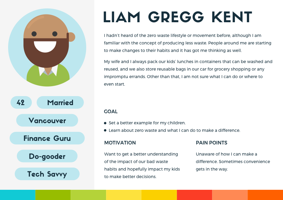
Personas ≠ People
To get a better understanding of what my users needed, I conducted a dozen in-depth qualitative interviews. These individuals ranged in age, gender and lifestyle. I was interested in getting to know them, their waste habits and their expectations from an app like Zero Waste.
From these interviews, I synthesized the data into a general topic map and then specifically into an affinity map. Furthermore, I compiled all these interviews and created two personas and two job stories to help guide my design decisions.

Job Stories:
When I take on a new habit of living a zero waste lifestyle, I want to have a tool by my side to help make the transition easier, so I can feel support and guidance throughout this new journey.
When I make choices for my family, I want to make sure that I am well informed and have the necessary tools to make these decisions, so that I can lead by example.

I learned that some people perform better and adhere better to challenges when there is a competitive component. Some even compared and created parallels between the Zero Waste app and Fitbit.
This helped me map out all features that were necessary to make this app the success that I wanted it to be.
Below is a chart that shows my thought process evolution. At first, I had looked at three zero waste websites, then added Fitbit to my competitive analysis and finally ironed out the features my users wanted.

User Flows
Once I had my job stories in hand, I was then able to move on to my user flows. I had multiple things to consider at this point.
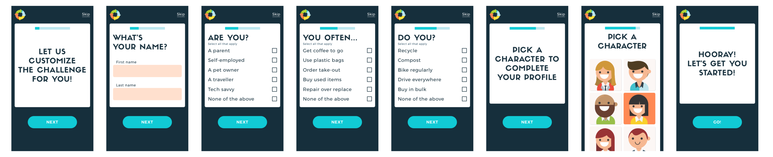
Onboarding:
Value proposition
Sign up form
Archetype Quiz
Tutorial
Would I need all these elements? I wanted to ensure to provide the user with a journey that goes from usable to delightful.

In-app:
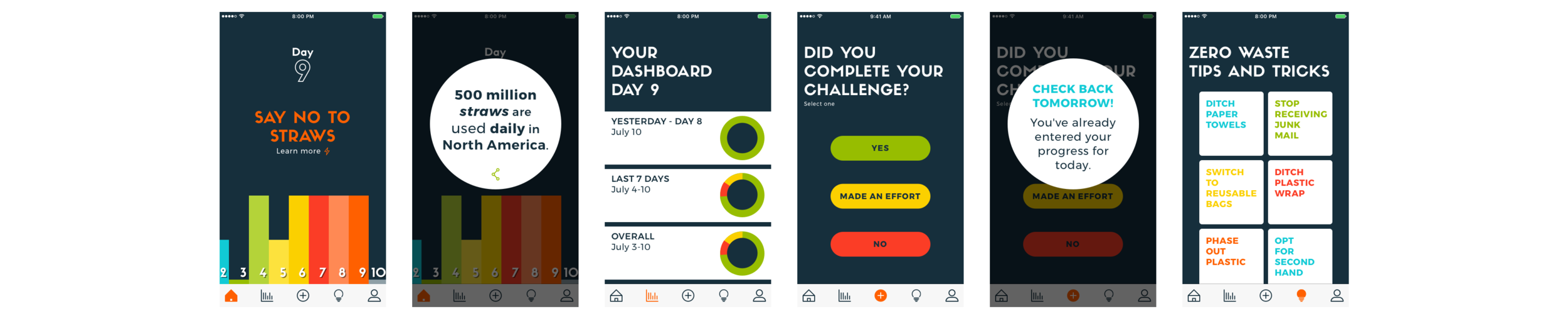
It was imperative to make all the main features accessible from the toolbar to make it as easy to navigate as possible. This includes:
The daily challenge
A fun fact
A dashboard
Progress log
Social challenge

After doing this exercise, I noticed one element that my personas required that was missing: a tips section – my users had expressed the need for an educational component.
I had to make a decision, and ultimately my personas dictated that it was more important to have a tips feature than to have a social challenge component.
Wireframing
Paper prototyping:
A few great reasons why this method of low fidelity wireframes was the right choice for me:
Start usability testing early in the design process: this helped me observe user interaction with my interface even before they were designed and developed.
Allowed me to communicate better my design ideas: an effective way of sharing my design with stakeholders and users.
Rapid evolution and testing: allows for quick modifications and refinement pointed out during usability testing.
Less resource consuming: all it takes is paper and a pencil.


After my first round of usability testing, I quickly learned what content I needed to focus on during the onboarding tutorial.
Once the adjustments were made and the second round of testing concluded, the results spoke for themselves. 100% of users who had gone through the tutorial, understood the specifics of the app.
Visual Design
Now that the sketches were completed, I could start thinking about the visual design of my app. First, I created a mood board; I realized that the common theme to my findings were illustrations, vector images, and icons. After which, I had to narrow down the ideas, pull the best elements and make them work together to build a style tile.

Colour:
Content first, that was the goal here. Dark backgrounds are known as highly efficient and attractive in cases when the interface is based more on graphic material than on copy. Keeping this in mind, I decided to go with a dark blue background and a rainbow colour pallet for the graphics, for a playful and inviting feel making the user feel comfortable. Due to the bold colour pallet, I kept the icon set light to provide an excellent sense of visual balance.
Typography:
For the logo and headline font, I picked Sifonn, a sans serif, a decorative font which works very well in all caps.
Montserrat was the font of choice for the body text, a familiar, legible and versatile font with a nice large x-height and a lot more character than Arial or Helvetica.
Design goal:

This is what I wanted the UI to feel like for the app to be appealing to a wider user base. The overall design is uncluttered, clean, large and well spaced.
User Testing and Validation
A/B testing:
My first challenge was the button design. Figuring out which design was not only visually appealing but also most functional. Thanks to some quick A/B testing I was able to determine which one my users felt was best for the app.

Card sorting
I knew I needed to understand my users better to tailor the challenge to their lifestyle. To do this, I needed to have a quick and easy questionnaire to understand their waste and lifestyle habits better. This seemed very simple and straightforward, but the challenge lay in making it a painless and delightful experience for the user.
For this, I used the card sorting method. This is a quick and cheap technique that allowed me to get a small user base to build out a category tree for me. This way the user is the one who groups the terms in whatever way they think is logical and gives each group a category label. This allowed me to see the structure and relationships between each term from the users perspective.

Think-aloud protocol:
Once my prototype was up and running, I needed to gather some more user feedback. After a bit of research, I found that given the timeframe I had the think-aloud protocol was a good way to go. For this, I gathered a small user group that identified with my main persona and started testing with them. I had them go through different flows while constantly thinking out loud, getting them to verbalize their thoughts as they were exploring the interface. This allowed me to go back and refine some details which were pointed out.

A never ending struggle yet a great way to iron out the kinks!

Key Learnings✌🏾
Although I have learned many things from this journey, two things stood out for me.
Personas:
They are a beneficial and valuable tool in that they can be applied across an entire development process. They helped me clarify and keep their goals at the top of mind. By creating good user personas, the whole process of creating became much easier. It made everything about the users who will ultimately be interacting with my product instead of relying on gut instinct.
Test, test, test:
Because your users always have the answers!